We all put a lot of thought into what clothing and accessories we wear in the photos we share online. What gets overlooked in this process is the backdrop against which our outfit choices are showcased.
This isn’t just a frame for you, but a fundamental part of the picture. Decisions here can subtly change perceptions and vibes. If you’re in the dark about what’s at play when picking backgrounds, hold tight and we’ll explain everything.
Exploring Color Psychology in Backgrounds
Color choices play with emotions and influence style perception. They both decorate and communicate with audiences.
For instance:
- Blue instills calmness and trust
- Red signals passion or urgency
- Green conveys freshness and balance
To narrow down your options, consider your brand’s essence. So if you want energy, use bright hues sparingly for a pop of something attention-grabbing. Conversely if you’re aiming to convey tranquility, keep in mind that cool tones create harmony.
Strategically chosen colors can elevate personal aesthetics online, making impressions stickier than super glue. Keep it consistent across platforms to build a cohesive image that resonates with your audience without shouting it in their faces.
And if the image you’ve captured doesn’t have quite the right combo of colors, you can always remove backgrounds easily with online tools like Canva. You’re then free to swap in whatever template or tone fits the mold of your budding personal brand.
Read More: How Colorful Trunks Elevate Your Summer Aesthetic: A Splash of Personality
The Role of Texture and Pattern in Imagery
Textures and patterns can breathe life into images. They evoke sensations that aren’t just about visuals, and feed into burgeoning influencer culture as much as they do brand-building, at least among those in the know.
For example:
- Smooth textures convey elegance
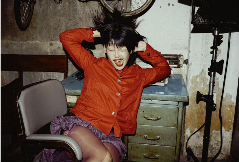
- Rough surfaces add depth
- Geometric patterns offer structure
Let’s say you’re aiming to highlight sophistication. In that case you should opt for sleek, seamless backdrops. If you’re pushing creativity or adventure, incorporate gritty details or asymmetrical shapes that captivate viewers’ attention.
Blending different textures thoughtfully enriches your narrative without overwhelming the eye. This technique guides viewers through your story with subtle cues, rather than bludgeoning them with overly conspicuous elements. So anyone looking to gain traction on Instagram, which is a platform used by 50% of people nationally, will benefit from standing out in this way.
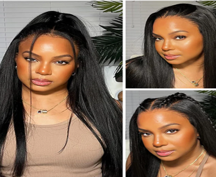
Read More: How glueless and pre-everything wigs are changing the hair game in 2025
How Cultural Influences Shape Image Environments
Culture often shapes visual expression, influencing what we find appealing and even changing the way we perceive something as seemingly fundamental as geometric shapes, as explored in academic research. This certainly applies to image backgrounds, as aspects featured here can meld with or contrast what you’re wearing.
For instance:
- Traditional motifs can convey heritage
- Urban settings reflect modernity
- Natural elements suggest a sense of calm outside of the man-made world
Choosing culturally resonant backgrounds showcases identity and connects with specific audiences. If you highlight tradition, incorporating cultural symbols adds authenticity. Alternatively if modern aesthetics align better, cityscapes or contemporary designs might suit your style.
Striking a balance between cultural influence and personal flair is a way to work towards genuine connections. This approach helps communicate nuanced messages visually and meaningfully across different contexts.
Wrapping Up
Thinking about the background of any image you share on social media, whether you’re expressing your personal style for the sake of it or building a brand in the hopes of making it marketable down the line, is a good move. Look into things like color, texture and cultural influences so that this process has the best possible end result.


